Tabs (AlpineJS)¤
(By @JuroOravec and @mscheper)
This example defines a tabs component. Tabs are dynamic - to change the currently opened tab, click on the tab headers.
To get started, use the following example to create a simple container with 2 tabs:
{% component "Tablist" id="my-tablist" name="My Tabs" %}
    {% component "Tab" header="Tab 1" %}
        This is the content of Tab 1
    {% endcomponent %}
    {% component "Tab" header="Tab 2" disabled=True %}
        This is the content of Tab 2
    {% endcomponent %}
{% endcomponent %}
API¤
The tab component is composed of two parts: Tablist and Tab. Here's how you can customize them.
Tablist component¤
The Tablist component is the main container for the tabs. It accepts the following arguments:
id(optional): A unique ID for the tab list. If not provided, it's generated from thename.name: The name of the tab list, used as a WAI-ARIA label for accessibility.selected_tab(optional): Theidof the tab that should be selected by default.container_attrs,tablist_attrs,tab_attrs,tabpanel_attrs(optional): Dictionaries of HTML attributes to be added to the corresponding elements.
Inside the Tablist's default slot you will define the individual tabs.
Tab component¤
The Tab component defines an individual tab. It MUST be nested inside a Tablist. It accepts the following arguments:
header: The text to be displayed in the tab's header.disabled(optional): A boolean that disables the tab ifTrue.id(optional): A unique ID for the tab. If not provided, it's generated from the header.
Use the Tab's default slot to define the content of the tab.
How it works¤
At the start of rendering, Tablist defines special context that Tabs recognize.
When a Tab component is nested and rendered inside a Tablist, it registers itself with the parent Tablist component.
After the rendering of Tablist's body is done, we end up with list of rendered Tabs that were encountered.
Tablist then uses this information to dynamically render the tab HTML.
Definition¤
"""
Alpine-based tab components: Tablist and Tab.

Based on https://github.com/django-components/django-components/discussions/540
"""

from dataclasses import dataclass
from typing import NamedTuple

from django.utils.safestring import mark_safe
from django.utils.text import slugify

from django_components import Component, register
from django_components import types as t

DESCRIPTION = "Dynamic tabs with AlpineJS."


@dataclass
class TabDatum:
    """Datum for an individual tab."""

    tab_id: str
    tabpanel_id: str
    header: str
    content: str
    disabled: bool = False


class TabContext(NamedTuple):
    id: str
    tab_data: list[TabDatum]
    enabled: bool


@register("_tabset")
class _TablistImpl(Component):
    """
    Delegated Tablist component.

    Refer to `Tablist` API below.
    """

    class Media:
        js = (
            # `mark_safe` is used so the script tag is usd as is, so we can add `defer` flag.
            # `defer` is used so that AlpineJS is actually loaded only after all plugins are registered
            mark_safe('<script src="https://cdn.jsdelivr.net/npm/alpinejs@3.x.x/dist/cdn.min.js" defer></script>'),
        )

    @dataclass
    class Kwargs:
        tab_data: list[TabDatum]
        id: str | None = None
        name: str | None = None
        selected_tab: str | None = None
        container_attrs: dict | None = None
        tablist_attrs: dict | None = None
        tab_attrs: dict | None = None
        tabpanel_attrs: dict | None = None

    def get_template_data(self, args, kwargs: Kwargs, slots, context):
        selected_tab = kwargs.selected_tab if kwargs.selected_tab is not None else kwargs.tab_data[0].tab_id
        tab_data = [
            (tab, tab.tab_id != selected_tab)  # (tab, is_hidden)
            for tab in kwargs.tab_data
        ]

        return {
            "id": kwargs.id,
            "name": kwargs.name,
            "container_attrs": kwargs.container_attrs,
            "tablist_attrs": kwargs.tablist_attrs,
            "tab_attrs": kwargs.tab_attrs,
            "tabpanel_attrs": kwargs.tabpanel_attrs,
            "tab_data": tab_data,
            "selected_tab": selected_tab,
        }

    template: t.django_html = """
        {% load component_tags %}
        <div
            x-data="{
                selectedTab: '{{ selected_tab }}',
            }"
            {% html_attrs
                container_attrs
                id=id
            %}
        >
            <div
                {% html_attrs
                    tablist_attrs
                    role="tablist"
                    aria-label=name
                %}
            >
                {% for tab_datum, is_hidden in tab_data %}
                    <button
                        :aria-selected="selectedTab === '{{ tab_datum.tab_id }}'"
                        @click="selectedTab = '{{ tab_datum.tab_id }}'"
                        {% html_attrs
                            tab_attrs
                            id=tab_datum.tab_id
                            role="tab"
                            aria-controls=tab_datum.tabpanel_id
                            disabled=tab_datum.disabled
                        %}
                    >
                        {{ tab_datum.header }}
                    </button>
                {% endfor %}
            </div>
            {% for tab_datum, is_hidden in tab_data %}
                <article
                    :hidden="selectedTab != '{{ tab_datum.tab_id }}'"
                    {% html_attrs
                        tabpanel_attrs
                        hidden=is_hidden
                        role="tabpanel"
                        id=tab_datum.tabpanel_id
                        aria-labelledby=tab_datum.tab_id
                    %}
                >
                    {{ tab_datum.content }}
                </article>
            {% endfor %}
        </div>
    """

    css: t.css = """
        /* based on https://codepen.io/brettsmason/pen/zYGEgZP */

        [role="tablist"] {
            margin: 0 0 -0.1em;
            overflow: visible;
        }

        [role="tab"] {
            position: relative;
            margin: 0;
            padding: 0.3em 0.5em 0.4em;
            border: 1px solid hsl(219, 1%, 72%);
            border-radius: 0.2em 0.2em 0 0;
            box-shadow: 0 0 0.2em hsl(219, 1%, 72%);
            overflow: visible;
            font-family: inherit;
            font-size: inherit;
            background: hsl(220, 20%, 94%);
        }

        [role="tab"]:hover::before,
        [role="tab"]:focus::before,
        [role="tab"][aria-selected="true"]::before {
            position: absolute;
            bottom: 100%;
            right: -1px;
            left: -1px;
            border-radius: 0.2em 0.2em 0 0;
            border-top: 3px solid LinkText;
            content: '';
        }

        [role="tab"][aria-selected="true"] {
            border-radius: 0;
            background: hsl(220, 43%, 99%);
            outline: 0;
        }

        [role="tab"][aria-selected="true"]:not(:focus):not(:hover)::before {
            border-top: 5px solid SelectedItem;
        }

        [role="tab"][aria-selected="true"]::after {
            position: absolute;
            z-index: 3;
            bottom: -1px;
            right: 0;
            left: 0;
            height: 0.3em;
            background: hsl(220, 43%, 99%);
            box-shadow: none;
            content: '';
        }

        [role="tab"]:hover,
        [role="tab"]:focus,
        [role="tab"]:active {
            outline: 0;
            border-radius: 0;
            color: inherit;
        }

        [role="tab"]:hover::before,
        [role="tab"]:focus::before {
            border-color: LinkText;
        }

        [role="tabpanel"] {
            position: relative;
            z-index: 2;
            padding: 0.5em 0.5em 0.7em;
            border: 1px solid hsl(219, 1%, 72%);
            border-radius: 0 0.2em 0.2em 0.2em;
            box-shadow: 0 0 0.2em hsl(219, 1%, 72%);
            background: hsl(220, 43%, 99%);
        }

        [role="tabpanel"]:focus {
            border-color: LinkText;
            box-shadow: 0 0 0.2em LinkText;
            outline: 0;
        }

        [role="tabpanel"]:focus::after {
            position: absolute;
            bottom: 0;
            right: -1px;
            left: -1px;
            border-bottom: 3px solid LinkText;
            border-radius: 0 0 0.2em 0.2em;
            content: '';
        }

        [role="tabpanel"] p {
            margin: 0;
        }

        [role="tabpanel"] * + p {
            margin-top: 1em;
        }
    """


@register("Tablist")
class Tablist(Component):
    """
    Dynamic tabs with [AlpineJS](https://alpinejs.dev/).

    After the input is processed, this component delegates to an internal implementation
    component that renders the content.

    `name` identifies the tablist and is used as a WAI-ARIA label

    `id`, by default, is a sligified `name`, we could be used to preselect a tab based
    on query parameters (TODO)

    Example:
    ```
    {% component "Tablist" id="my-tablist" name="My Tabs" %}
        {% component Tab header="Tab 1" %}
            This is the content of Tab 1
        {% endcomponent %}
        {% component Tab header="Tab 2" disabled=True %}
            This is the content of Tab 2
        {% endcomponent %}
    {% endcomponent %}
    ```

    """

    template: t.django_html = """
        {% load component_tags %}
        {% provide "_tab" ...tab_context %}
            {% slot "content" default / %}
        {% endprovide %}
    """

    class Kwargs:
        id: str | None = None
        name: str = "Tabs"
        selected_tab: str | None = None
        container_attrs: dict | None = None
        tablist_attrs: dict | None = None
        tab_attrs: dict | None = None
        tabpanel_attrs: dict | None = None

    def get_template_data(self, args, kwargs: Kwargs, slots, context):
        self.tablist_id: str = kwargs.id or slugify(kwargs.name)
        self.tab_data: list[TabDatum] = []

        tab_context = TabContext(
            id=self.tablist_id,
            tab_data=self.tab_data,
            enabled=True,
        )

        return {
            "tab_context": tab_context._asdict(),
        }

    def on_render_after(self, context, template, result, error) -> str | None:
        """
        Render the tab set.

        By the time we get here, all child Tab components should have been rendered,
        and they should've populated the tablist.
        """
        if error or result is None:
            return None

        kwargs: Tablist.Kwargs = self.kwargs

        # Render the TablistImpl component in place of Tablist.
        return _TablistImpl.render(
            kwargs=_TablistImpl.Kwargs(
                # Access variables we've defined in get_template_data
                id=self.tablist_id,
                tab_data=self.tab_data,
                name=kwargs.name,
                selected_tab=kwargs.selected_tab,
                container_attrs=kwargs.container_attrs,
                tablist_attrs=kwargs.tablist_attrs,
                tab_attrs=kwargs.tab_attrs,
                tabpanel_attrs=kwargs.tabpanel_attrs,
            ),
            deps_strategy="ignore",
        )


@register("Tab")
class Tab(Component):
    """
    Individual tab, inside the default slot of the `Tablist` component.

    Example:
    ```
    {% component "Tablist" id="my-tablist" name="My Tabs" %}
        {% component Tab header="Tab 1" %}
            This is the content of Tab 1
        {% endcomponent %}
        {% component Tab header="Tab 2" disabled=True %}
            This is the content of Tab 2
        {% endcomponent %}
    {% endcomponent %}
    ```

    """

    template: t.django_html = """
        {% load component_tags %}
        {% provide "_tab" ...overriding_tab_context %}
            {% slot "content" default / %}
        {% endprovide %}
    """

    class Kwargs:
        header: str
        disabled: bool = False
        id: str | None = None

    def get_template_data(self, args, kwargs: Kwargs, slots, context):
        """
        Access the tab data registered for the parent Tablist component.

        This raises if we're not nested inside a Tablist component.
        """
        tab_ctx: TabContext = self.inject("_tab")

        # We accessed the _tab context, but we're inside ANOTHER Tab
        if not tab_ctx.enabled:
            raise RuntimeError(
                f"Component '{self.name}' was called with no parent Tablist component. "
                f"Either wrap '{self.name}' in Tablist component, or check if the "
                f"component is not a descendant of another instance of '{self.name}'"
            )

        if kwargs.id:
            slug = kwargs.id
        else:
            group_slug = slugify(tab_ctx.id)
            tab_slug = slugify(kwargs.header)
            slug = f"{group_slug}_{tab_slug}"

        self.tab_id = f"{slug}_tab"
        self.tabpanel_id = f"{slug}_content"
        self.parent_tabs: list[TabDatum] = tab_ctx.tab_data

        # Prevent Tab's children from accessing the parent Tablist context.
        # If we didn't do this, then you could place a Tab inside another Tab,
        # ```
        # {% component Tablist %}
        #     {% component Tab header="Tab 1" %}
        #         {% component Tab header="Tab 2" %}
        #             This is the content of Tab 2
        #         {% endcomponent %}
        #     {% endcomponent %}
        # {% endcomponent %}
        # ```
        overriding_tab_context = TabContext(
            id=self.tab_id,
            tab_data=[],
            enabled=False,
        )

        return {
            "overriding_tab_context": overriding_tab_context._asdict(),
        }

    # This runs when the Tab component is rendered and the content is returned.
    # We add the TabDatum to the parent Tablist component.
    def on_render_after(self, context, template, result, error) -> None:
        if error or result is None:
            return

        kwargs: Tab.Kwargs = self.kwargs

        self.parent_tabs.append(
            TabDatum(
                tab_id=self.tab_id,
                tabpanel_id=self.tabpanel_id,
                header=kwargs.header,
                disabled=kwargs.disabled,
                content=mark_safe(result.strip()),
            ),
        )
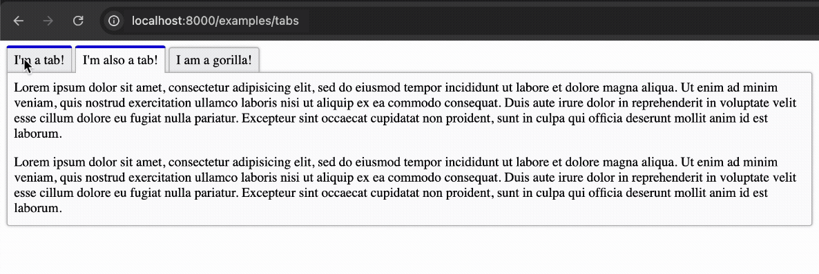
Example¤
To see the component in action, you can set up a view and a URL pattern as shown below.
views.py¤
This example shows how to render a full page with the tab component.
from django.http import HttpRequest, HttpResponse

from django_components import Component, types


class TabsPage(Component):
    template: types.django_html = """
      <html>
        <head>
          <title>Tabs</title>
        </head>
        <body>
          {% component "Tablist"
            id="optional-tablist-id"
            name="Bonza tablist"
            container_attrs:class="optional-container-attrs"
            tablist_attrs:class="optional-tablist-attrs"
            tab_attrs:class="optional-tab-attrs"
            tabpanel_attrs:class="optional-panel-attrs"
          %}
            {% component "Tab" id="optional-tab-id" header="I'm a tab!" %}
              {% lorem %}
            {% endcomponent %}
            {% component "Tab" header="I'm also a tab!" %}
              <p>{% lorem %}</p>
              <p>{% lorem %}</p>
            {% endcomponent %}
            {% component "Tab" header="I am a gorilla!" %}
              <p>{% lorem %}</p>
              <p>I wonder if anyone got the Monty Python reference. 🤔</p>
            {% endcomponent %}
          {% endcomponent %}
        </body>
      </html>
    """

    class View:
        def get(self, request: HttpRequest) -> HttpResponse:
            return TabsPage.render_to_response(request=request)